Isabelle Morr • April 18, 2025
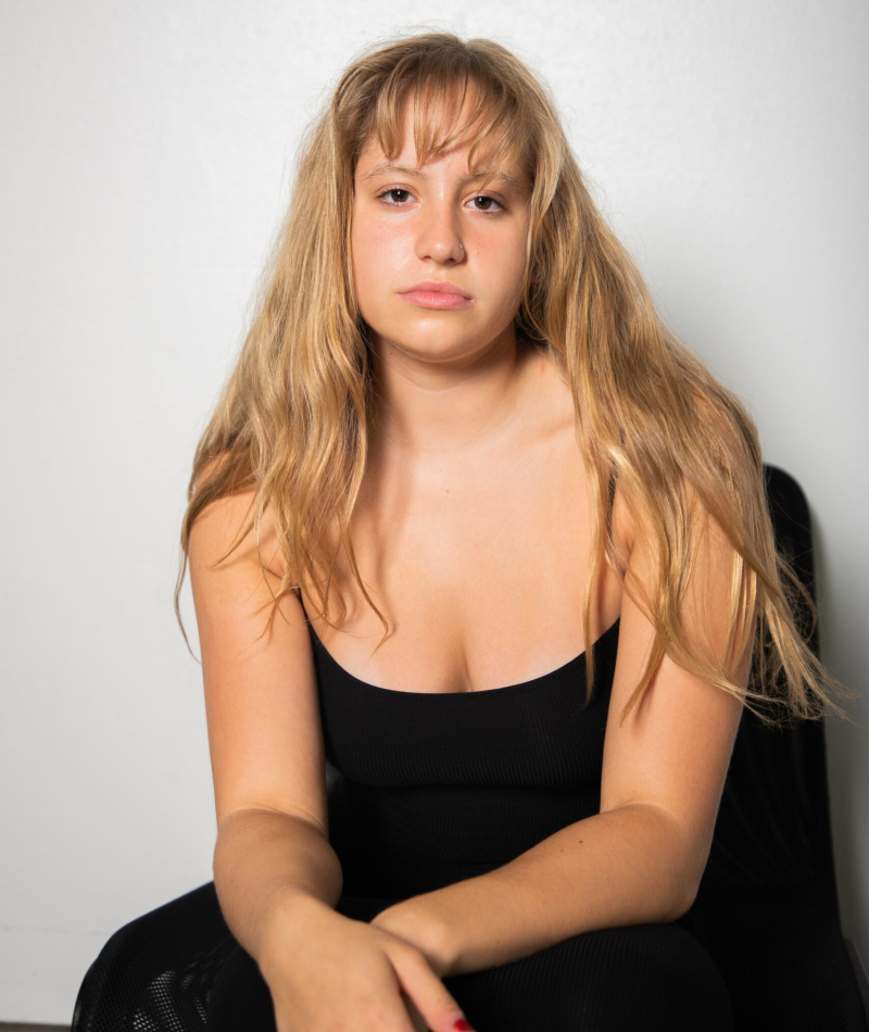
This is how rebellious, alternative fashion is making its way back into society
Author: Isabelle Morr
Isabelle is a junior at Chapman University located in Orange, California. She's a Strategic Corporate Communications major with a minor in Art History. Isabelle has a passion for the creative industry and is looking to pursue a career within fashion.
I asked our PR & Growth Experts: Punk streetwear has made its way back into fashion with Whimsigothic and 90s grunge aesthetic. How can rising designers and brands incorporate this trend into their campaigns and collections? What is a popular color scheme brands should follow regarding grunge fashion? How can brands make this trend inclusive for everyone?
Here is the insight from our experts.
- Ditch the polish
- Thrive on contradiction
- It’s about attitude
- Hold space for different identities and emotional states
- Contrast is the visual anchor
- Tie your campaigns to the subculture
Ditch the polish
Emily Reynolds, Owner at R Public Relations
"Gone are the days of white, beige, and brown. Consumers are craving color and pigment! A simple way to take advantage of the grunge aesthetic is to use dark grey or black as a core color in your work. You might also include design elements like eyelets and studs. Have fun and don’t take your work too seriously–grunge aesthetic is not about being perfect or polished, after all. Consumers want to see real humans these days, and the grunge trend is a reflection of that."
Thrive on contradiction
Zazie Productions
"As someone who operates at the intersection of digital subcultures, synesthetic design, and underground music, I approach fashion trends not just as aesthetics—but as encoded emotional languages. I’ve designed software that maps color psychology to niche micro-aesthetics, and my work as a graphic artist and music curator has focused on translating fringe culture into tactile brand identity systems.
Whimsigoth and Grunge aren’t just trends—they’re memory triggers. They appeal to a collective nostalgia filtered through Gen Z’s remix logic: the sepia-sick day haze of The Craft, torn fishnets on thrifted floorboards, the haunted velvet of early Hot Topic. These are not styles; they’re affective time machines.
How to Incorporate Grunge x Whimsigoth into Campaigns:
1. Use Design as Spellcasting.
Grunge thrives on contradiction—lo-fi textures with high-emotion palettes. Think layered transparencies, worn typography, and tactile imperfection. Whimsigoth leans ritualistic: sigil patterns, moon-phase motifs, stained-glass gradients. Let your visuals feel hand-touched, corrupted, felt.
2. Design with Subcultural Fluency, Not Costume.
Know your references. Designers shouldn’t just moodboard Nirvana tees—they should understand the D.I.Y. Xerox economy that birthed punk fashion. For instance:
Vivienne Westwood’s Seditionaries line didn’t just “look punk.” It was weaponized satire. The ‘Destroy’ shirt used a swastika not for shock, but to denounce fascism—fashion as semiotic grenade. That’s the real history. It matters.
3. Color Scheme That Feels Like a Basement Show.
Popular grunge palettes aren’t just “dark.” They’re dirty. Think:
• Burnt raisin
• Nicotine yellow
• Molded lilac
• Ash rose
• Mossy teal
Use gradients that feel like a bruised sky at 3am, or palettes sampled from VHS static, rusted zippers, thrifted journal covers.
4. Make It Inclusive By Leaving the Gate Open.
Punk was always for the outcasts. True grunge is genderless, size-agnostic, neurodivergent-friendly. Build adaptive sizing, non-binary silhouettes, and sensory-aware materials (loose seams, soft linings). Let people style from the inside out. Your brand isn’t grunge if it feels exclusive. Authenticity is access.
Micro-trends to Watch from Gen Z Subcultures:
• Chiarocore: A fusion of chiaroscuro lighting, existential Catholic guilt, and sad-girl ravewear.
• Dead Muppet Chic: Grunge meets Jim Henson’s darker palette—think faux-fur in greyscale, felt appliqué, and muppet textures with torn concert tee silhouettes.
• Post-Liminal Maximalism: Layered, overstimulated textures that mimic internet nostalgia, dissociation, and overstimulation recovery aesthetics"
It’s about attitude
Borets Stamenov, Co-Founder & CEO at SeekFast
"Grunge isn’t about looking cool—it’s about not caring if you do. That’s the key. Don’t polish the edges. Show behind-the-scenes, raw process, messy workspaces. Feature real people, not models. The less curated, the more authentic.
Color-wise, think desaturated—washed black, muted olive, dirty plum, rust red. Avoid high contrast. It should feel like it’s been through the wash a hundred times. Bonus points for textures that look worn: crushed velvet, frayed denim, sun-faded prints.
For inclusivity, grunge is your best friend. It was never about body type or gender—it’s about attitude. Oversized fits, layered looks, and thrift-core aesthetics naturally adapt to all shapes. Highlight that in your campaigns. Make it clear: this isn’t about fitting in—it’s about not giving a damn."
Hold space for different identities and emotional states
Ronak Kadhi, Founder at Bundled.design
"At our visual studio, we create AI-generated imagery and video for brands looking to experiment with style, mood, and cultural references - grunge has been making a serious return lately, but not in the way people expect.
For emerging designers, the smartest way to bring this into a campaign is by focusing on texture and mood before clothing details. Matte layers, raw edges, smeared or distorted patterns. Campaigns should feel unpolished but intentional, almost like a memory or a glitch in time. It helps to create a visual world first—then the product lives inside that.
The updated grunge palette leans muddy and offbeat: dirty lavender, rusted green, soft charcoal, sun-faded red. The colors feel worn, but not worn out.
Inclusion should be built into the visual tone, not added at the end. That means diverse casting, but also showing softness in how people carry themselves. Messy doesn’t mean aggressive. Let the visuals hold space for different bodies, identities, and emotional states. The original spirit of grunge was about not fitting in. That still matters."
Contrast is the visual anchor
MJ Jay, Founder & Director of Sales and Marketing at YORKSHIRE FABRIC SHOP
"I work daily with color, tone, and material, which makes me hyper-attuned to the return of fashion movements like punk and grunge, especially as they rewire mainstream campaigns.
Designers tapping into this wave need to lead with tension. Punk streetwear works because it holds friction. Soft mesh against heavy leather. Washed plaids next to vinyl. That contrast is the visual anchor. Brands who play too safe with “inspired by” versions lose the edge. Commit or skip it. Grunge sells on defiance. The campaigns that work lean into distortion—blurred shots, chopped layout, raw backgrounds. Think less polished product shot, more DIY zine with real attitude. That is how you make it feel lived-in, not costume.
Color-wise, go beyond black. Use oxblood, cement gray, nicotine yellow, washed teal and rust. Push shades that feel stained or faded. Not synthetic shine. People want grit they can wear. And to make it inclusive, size everything wide and cast talent that looks like they styled themselves. Drop the filters. Let the personality lead. Fashion’s new rebellion is about feeling real, not curated."
Pitch your brand to 2,300+ fashion journalists. PR ON THE GO provides you with a database in a spreadsheet containing 2,300+ fashion editor email contacts.
Get the PR ON THE GO Global Fashion+Beauty Media List hereTie your campaigns to the subculture
Borets Stamenov, Co-Founder & CEO at SeekFast
"Campaign Integration: Rising designers should fuse nostalgia with modernity. Think limited-edition drops featuring collaborations with underground artists or musicians tied to the subculture. Raw, do-it-yourself social media material (think grainy films or zine-inspired graphics) connects more deeply than overly polished images.
Colour Scheme: For a gritty '90s look, stick to subdued hues like charcoal, olive, and washed-out burgundy. For contrast and an homage to punk's attitude without overpowering the grunge foundation, add splashes of acid yellow or neon green.
Since the counterculture gave rise to grunge, inclusion is a must. Provide gender-neutral cuts, expanded sizes, and adjustable styles. Collaborate on campaigns with grassroots groups (such as independent artists or LGBTQ+ collectives) to make sure the trend stays true to its rebellious origins rather than being diluted into purely aesthetics."
#PRontheGO
Subscribe to the PR ON THE GO newsletter.
Receive the latest media news in your inbox. Discover journalists and start pitching!