Pavlina Korleti • December 4, 2025
How Artist’s Can Use Pantone’s 2026 Color of the Year, Cloud Dancer, to their Advantage
Art PR

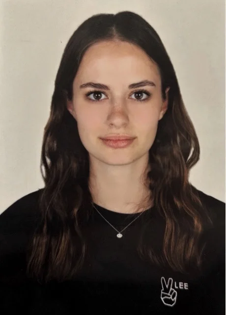
Author: Pavlina Korleti
Pavlina is a third year Communication student at the American College of Greece and simultaneously minors in Graphic Design. For the first year of her studies she was at Leiden University studying Art, Media and Society. From wandering Athens’ museums and exhibitions to exploring and deepening her other hobbies and interests Pavlina tends to stay creatively busy. At PR ON THE GO she is excited to enhance her experience in the field of Public Relations through her passion for art.
Every December, the creative industry pauses for a second of collective anticipation for Pantone’s announcement of Color of the Year. The shade they pick is rather complex as it acts as yearly cultural signal aiming to reflect global trends, shifts in aesthetics and the collective imagination of the moment. For artists this is more than just a piece of industry news, it is rather an opportunity.
For 2026, the Color of the Year is Cloud Dancer, which is a crisp, elegant and weightless white that feels both timeless and forward-looking. Cloud Dancer, with its clean, airy, and luminous elements, in a way represents clarity, openness and a return to the safe and essentials. In a complex cultural and constantly evolving environment this shade works as an invitation to breathe, rest and value simplicity.
Why Cloud Dancer Resonates in 2026
Pantone’s annual announcement is proven to influence visual trends across art, design, branding, fashion, digital media and interior design. A hallmark of Color of the Year selections is their emotional symbolism and Cloud Dancer specifically, speaks directly to themes shaping 2026: simplicity and clarity, a desire for lightness, purity and openness and timeless minimalism. Consequentially, its versatility makes it a powerful tool for artists working in any medium and form.
Ways Artists can Creatively Use Cloud Dancer
1. As a Narrative Device:
Artists can use this hue to shape mood and meaning, especially in contemplative or atmospheric works, as it can symbolize renewal, reflection, new beginnings and emotional openness.
2. As a Foundation for Contrast:
Cloud Dancer’s strength appears when paired with accent tones and artists can use it to highlight deep blues, dark greys, earthy browns, pastel tones and metallics. This contrast makes compositions feel intentional modern.
3. As a Minimalist Focal Point
Artists that enjoy exploring minimalism can use Cloud Dancer as the ‘hero color’, with its brightness that allows for architectural compositions, line-based drawings, abstract geometric works, sculptural pieces and photographic studies. Ultimately, its purity invites viewers to focus on shape, movement and emotion.
4. In Digital Art & Branding
The colors neutrality complements typography, gradients and overlays making it a commercially appealing choice for freelance illustrators and designers. Therefore, Cloud Dancer works very well in social media graphics, website palettes and digital posters and more.
Why Embracing Cloud Dancer is Advantageous for Artists
Embracing Cloud Dancer early in the year gives artists an immediate edge positioning their work within one of the biggest visual conversations of 2026 since Pantone’s Color of the Year drives searches, hashtags and trend cycles across social platforms. Therefore, art that incorporates Cloud Dancer naturally becomes more discoverable and shareable. Artists who demonstrate fluency with neutral, elegant aesthetic aligns with interior design and lifestyle trends expanding the commercial potential of artworks and making them attractive to collectors, galleries and lifestyle-focused buyers. Basically, Cloud Dancer helps artists amplify their visibility, relevance and marketability in 2026.

Pitch your art or interior design work to 350+ art & design journalists. PR ON THE GO provides a spreadsheet containing over 350 journalist contacts from art, design, interior, home, and architecture magazines /media international.
Get the PR ON THE GO Global Art+Design Media List here#PRontheGO
Subscribe to the PR ON THE GO newsletter.
Receive the latest media news in your inbox. Discover journalists and start pitching!